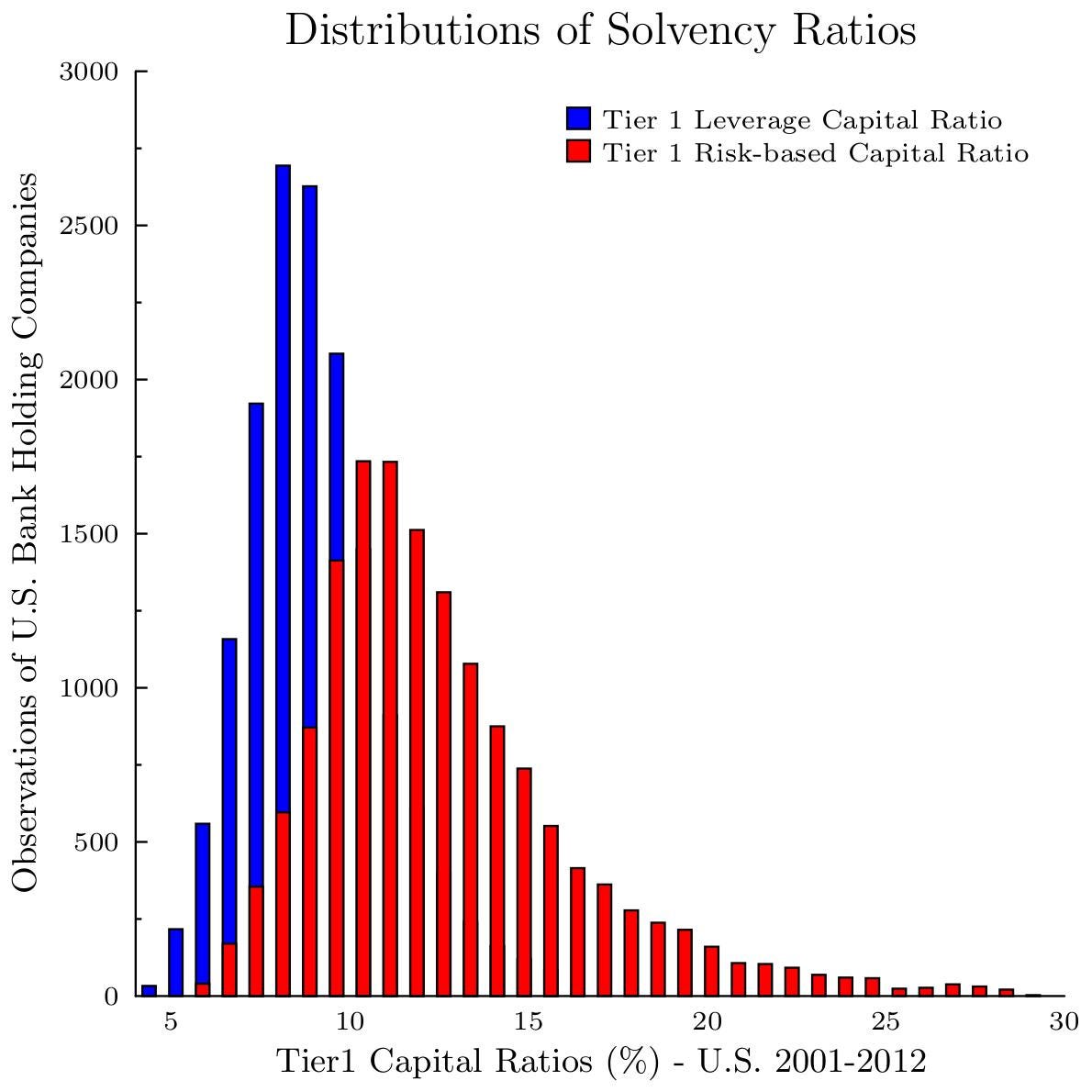
Leverage Capital Ratios vs Risk-Based Capital Ratios of U.S. Banks, a graph.
Following up on my graph on corporate versus bank solvency ratios, this graph illustrates the difference between two Tier 1 ratios reported by U.S. Bank Holding Companies over 2001-2012.

The blue histogram shows the Tier 1 Leverage Capital ratio, the red histogram shows the Tier 1 Risk-Based Capital ratio.
Both measures use the same numerator: Tier 1 cap…

